Student Assignment: For this project, the task was to create a new brand identity for Minotaur Publishing LLC, formed after the merge of Neilsen-Lifearts and Finale Books. Minotaur Publishing markets both fiction and nonfiction work by contemporary and cutting-edge authors. With the new merger, Minotaur Publishing wanted to ensure the new branding visualized their mission statement of re-engaging public interest in the past time of reading printed books and staying current in worldly affairs.
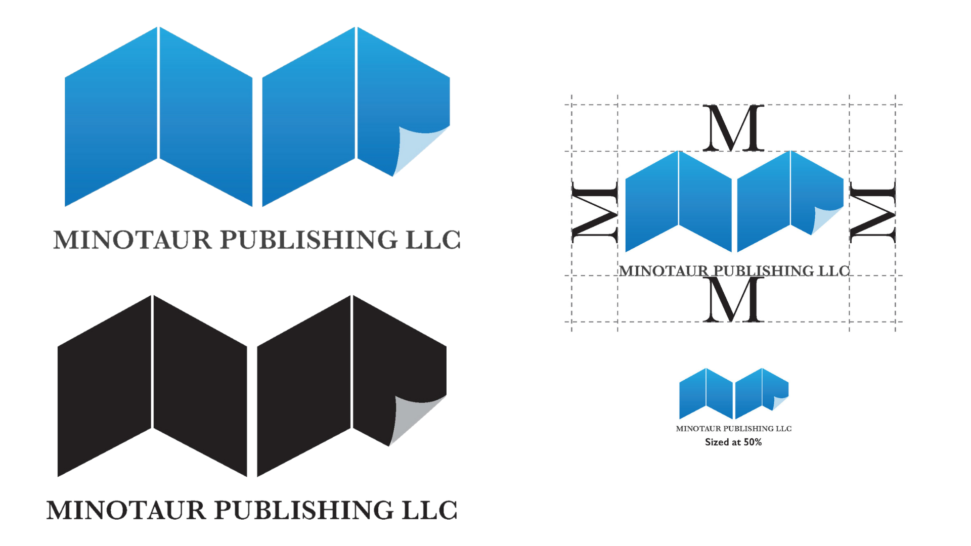
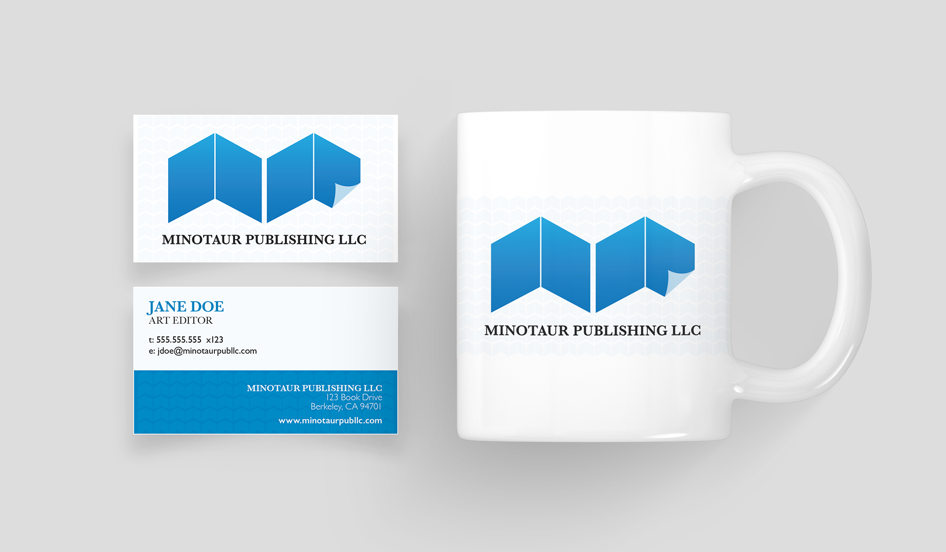
Taking the simplified outline of opened books placed side-by-side with a curved page created a contemporary monogram of the letter “M”, further visualizing the company's goal of the importance of reading books. This would become the main component of the Minotaur Publishing Logo. Paired with the classic Baskerville typeface, this completed the contemporary graphic and added a touch of elegance.
For the color palette, various hues of blue was selected to represent the trust, honesty, and loyalty of the company with it's audience. Thus, exhibiting an inner security and confidence in addition to promoting both a physical and mental relaxation when seen, similar to the feeling you get when reading a book.

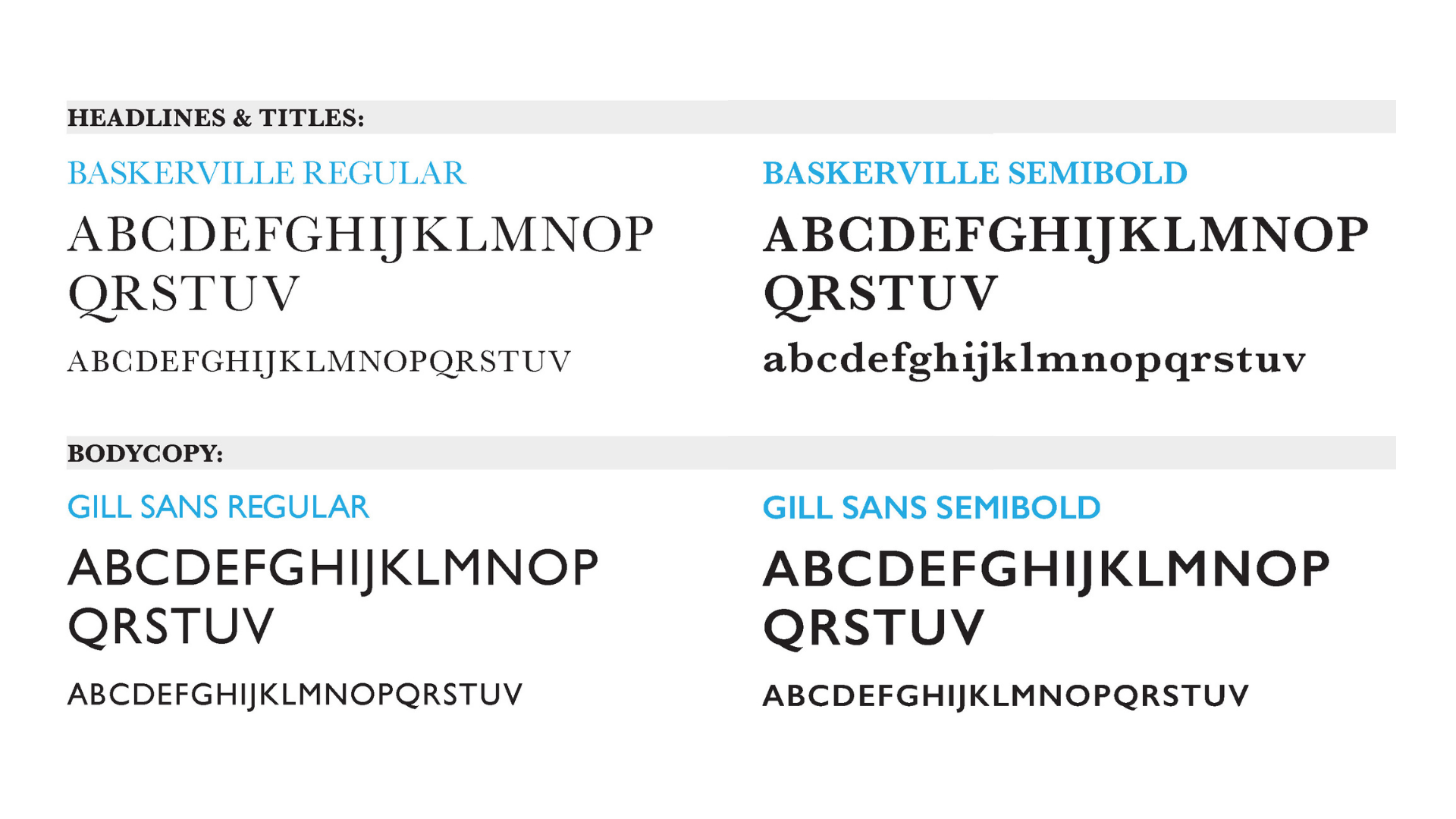
The complete look of the logo was incorporated into the company’s stationery (i.e.: business card, letterhead, and envelope). In addition to the brand identity, a style guide was created to showcase the proper usage of the new logo, branded colors, and font styles to create consistency when used on any platform.